Example usages of charticle.
charticle.venn examples
The charticle.venn package contains classes for Venn diagrams.
Venn2
Two-circle Venn diagrams are supported (at v0.0.2+).
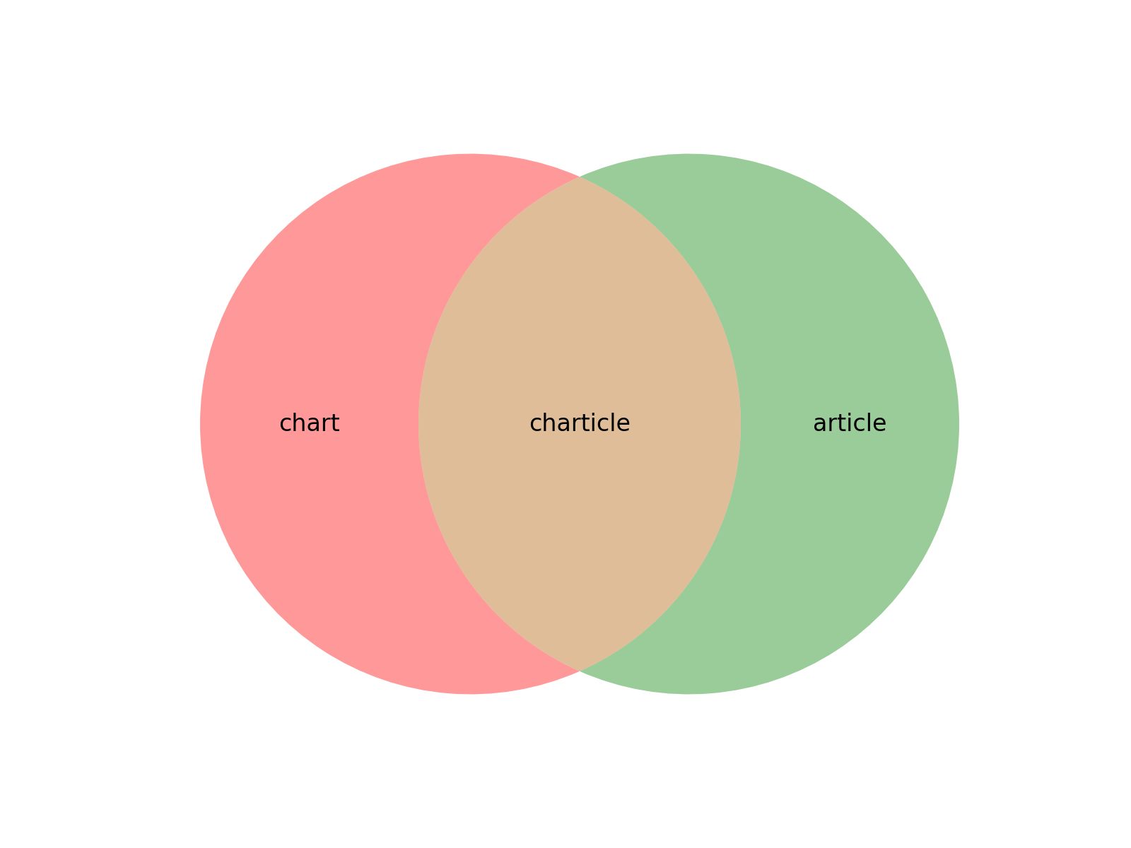
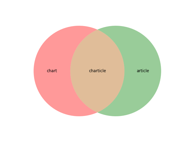
>>> from matplotlib import pyplot as plt
>>> from charticle.venn import Venn2
>>> v2 = Venn2(a="chart", b="article")
>>> v2.ab = "charticle"
>>> _ = v2.plot()
(Source code, png, hires.png, pdf)
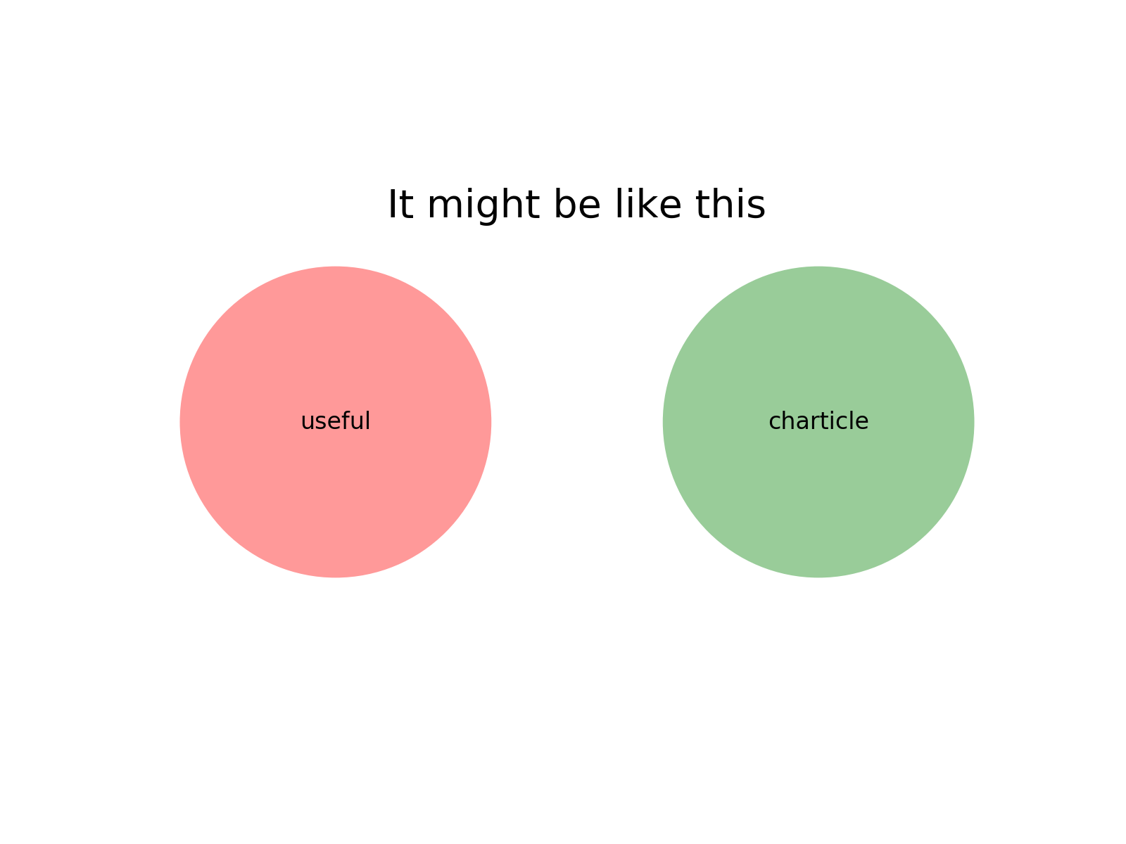
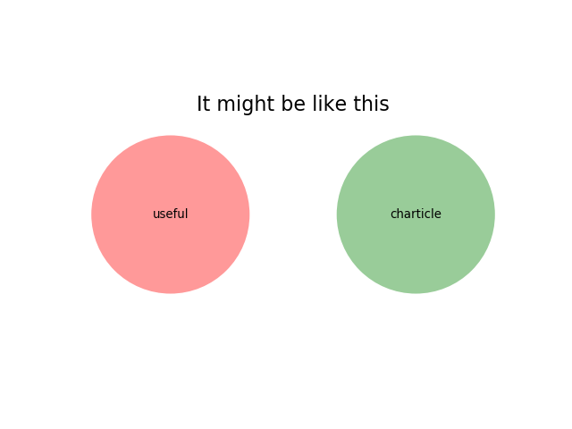
but beware:
>>> from charticle.venn import Venn2
>>> v = Venn2(title="It might be like this", a="useful", b="charticle",
...   sizes=Venn2.Sizes(ab=0.0))
>>> _ = v.plot()
(Source code, png, hires.png, pdf)
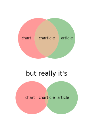
And you can apply these to subplots, too:
>>> import matplotlib.pyplot as plt
>>> from charticle.venn import Venn2
>>> fig = plt.figure()
>>> fig.set_size_inches(4, 6)
>>> v = Venn2(a="chart", b="article", ab="charticle")
>>> ax1, ax2 = (fig.add_subplot(211), fig.add_subplot(212))
>>> _ = v.plot(ax1)
>>> v.title = "but really it's"
>>> v.sizes.a *= 10
>>> v.sizes.b *= 10
>>> v.sizes.ab *= 0.5
>>> _ = v.plot(ax2)
(Source code, png, hires.png, pdf)

because the intersection of charts and articles is really quite tiny.
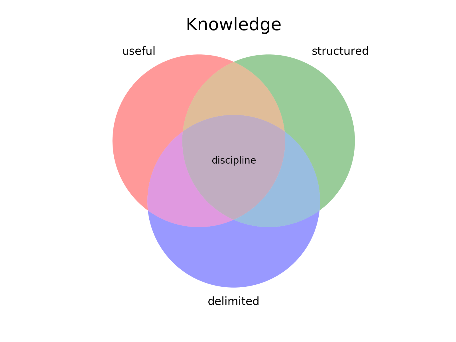
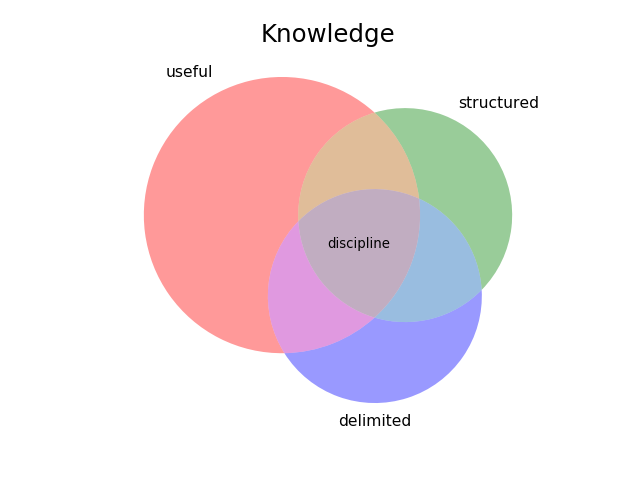
Venn3
Three-circle Venn diagrams are supported, pace Drew Conway’s data science (last in this section).
>>> from charticle.venn import Venn3
>>> v3 = Venn3(a_name="useful", b_name = "structured", c_name="delimited")
>>> v3.abc = "discipline"
>>> v3.title = "Knowledge"
>>> v3.fontsizes.title = 22
>>> v3
Venn3(a_name='useful', b_name='structured', c_name='delimited', ...))
>>> _ = v3.plot()
(Source code, png, hires.png, pdf)

Further can set region sizes:
>>> v3.sizes
Venn3.Sizes(a=1.0, b=1.0, c=1.0, ab=1.0, ac=1.0, bc=1.0, abc=1.0, normalize=1.0)
>>> v3.sizes.set_single_weight(1.0) # moot
Venn3.Sizes(a=1.0, b=1.0, c=1.0, ab=1.0, ac=1.0, bc=1.0, abc=1.0, normalize=1.0)
>>> v3.sizes.a *= 5
>>> v3.sizes.set_double_weight(2.0)
Venn3.Sizes(a=5.0, b=1.0, c=1.0, ab=2.0, ac=2.0, bc=2.0, abc=1.0, normalize=1.0)
>>> _ = v3.plot()
(Source code, png, hires.png, pdf)
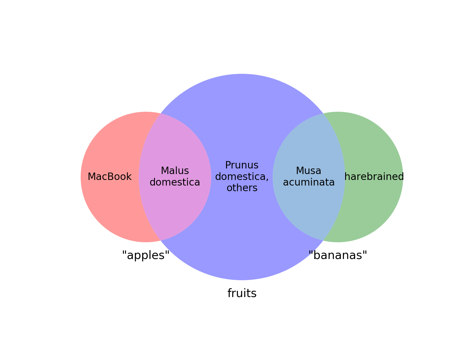
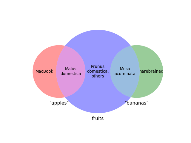
If regions are given a zero size, the diagram will reorganize:
>>> from charticle.venn import Venn3
>>> v = Venn3(a_name='"apples"', b_name='"bananas"',  c_name="fruits")
>>> v.a = "MacBook"
>>> v.b = 'harebrained'
>>> v.c = "Prunus\ndomestica,\nothers"; v.sizes.c = 3
>>> v.ac = "Malus\ndomestica"
>>> v.bc = "Musa\nacuminata"
>>> v.sizes.ab = 0; v.sizes.abc = 0
>>> _ = v.plot()
(Source code, png, hires.png, pdf)
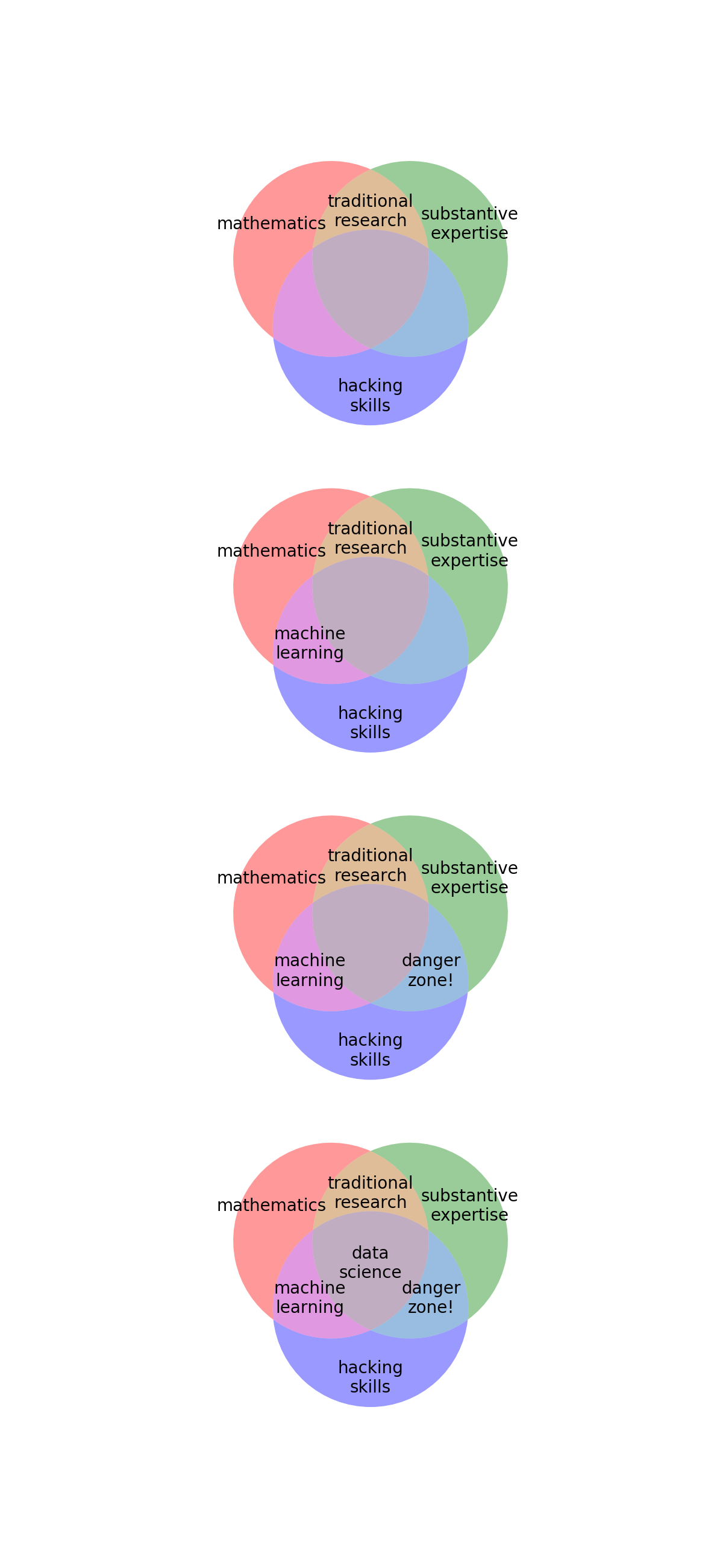
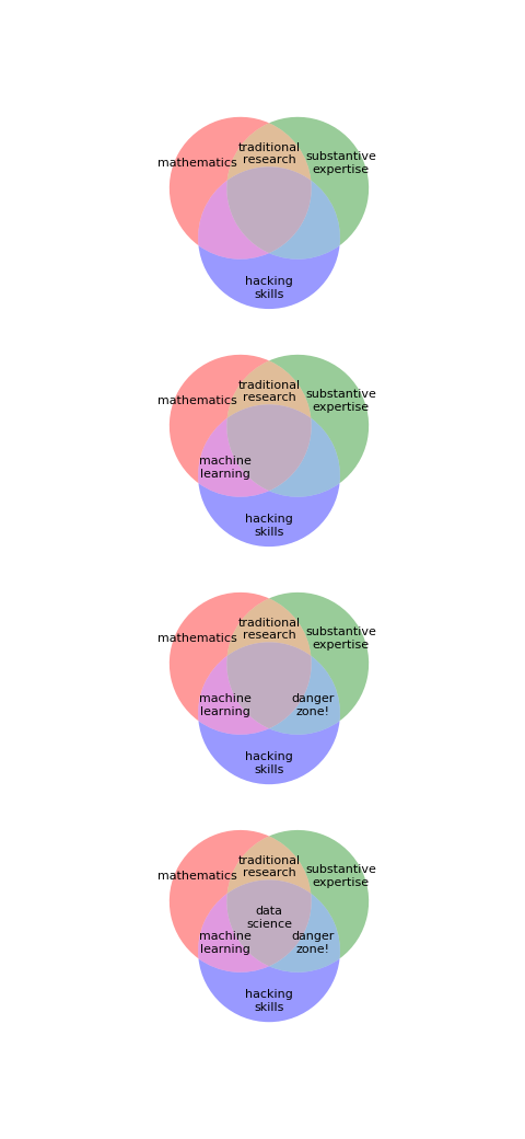
And you can still do multiple plots by passing an axis object to plot.
>>> import matplotlib.pyplot as plt
>>> from charticle.venn import Venn3, FontSizes
>>> fig = plt.figure()
>>> fig.set_size_inches(6,13)
>>> v = Venn3(a="mathematics", b="substantive\nexpertise",
...  c="hacking\nskills",
...  fontsizes=FontSizes(intersections=10),
...  sizes=Venn3.Sizes(normalize=30))
>>> ax1, ax2, ax3, ax4 = (fig.add_subplot(411), fig.add_subplot(412),
...   fig.add_subplot(413), fig.add_subplot(414))
>>> v.ab = "traditional\nresearch"; _ = v.plot(ax1)
>>> v.ac = "machine\nlearning"; _ = v.plot(ax2)
>>> v.bc = "danger\nzone!"; _ = v.plot(ax3)
>>> v.abc = "data\nscience"; _ = v.plot(ax4)
(Source code, png, hires.png, pdf)
charticle.hierarchy examples
The charticle.hierarchy package contains classes for pyramid
diagrams, like Maslow’s hierarchy.
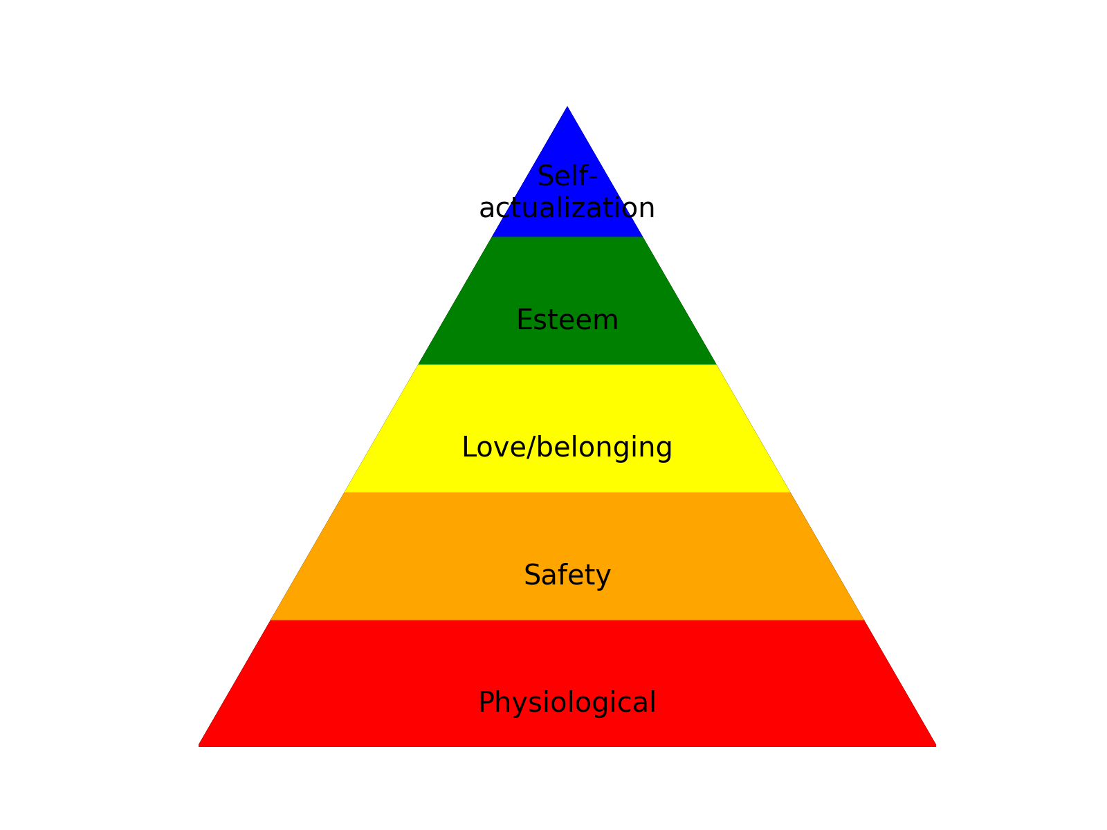
Hierarchy
>>> from matplotlib import pyplot as plt
>>> from charticle.hierarchy import Hierarchy
>>> h = Hierarchy(layer_text_defaults=dict(size='large'))
>>> _ = h.set_layers(['Physiological', 'Safety', 'Love/belonging',
...                   'Esteem','Self-\nactualization'])
>>> h.plot()
>>> _ = plt.axis('scaled'); _ = plt.axis('off')
(Source code, png, hires.png, pdf)

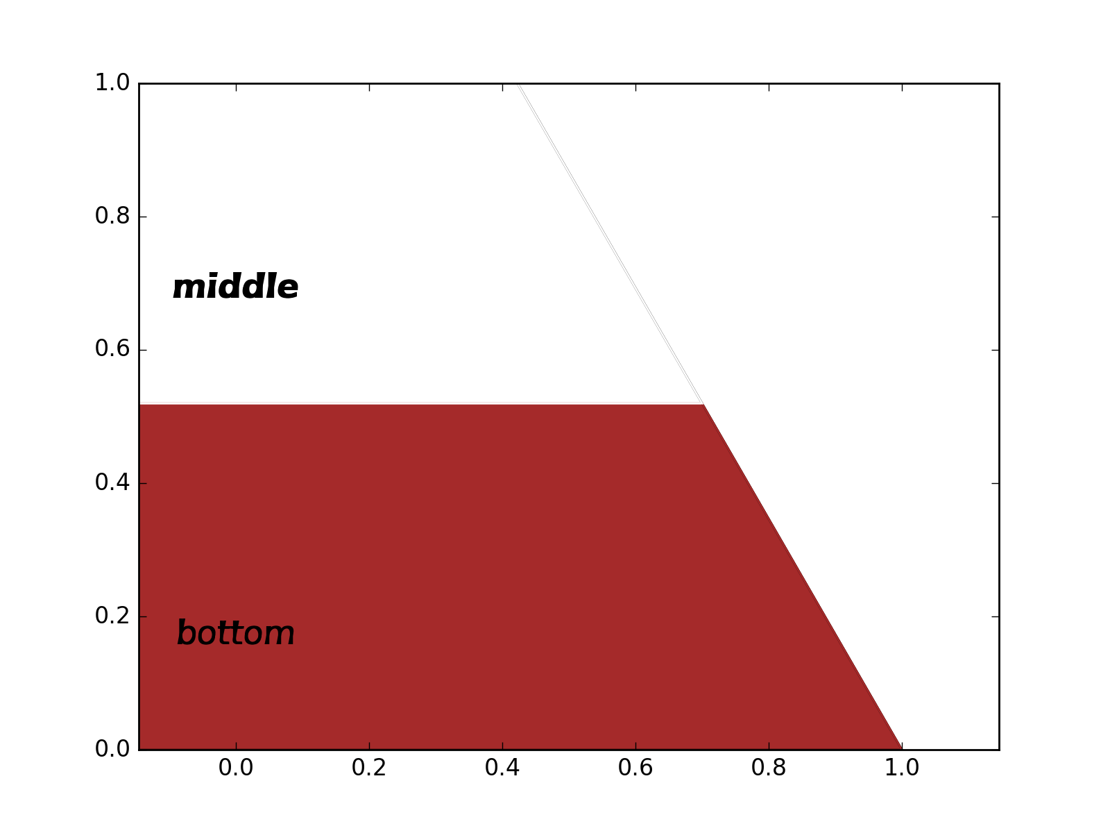
You may of course set the colors as a whole or override them one at a time.
>>> from matplotlib import pyplot as plt
>>> from charticle.hierarchy import Hierarchy
>>> h = Hierarchy(layer_text_defaults=dict(size='x-large'))
>>> h.set_color_cycle('brown', 'white', 'pink')
>>> l1 = h.add_layer(lower=0.0, upper=0.3, label='bottom')
>>> l2 = h.add_layer(lower=0.3, upper=0.6, label='middle',
...                  text={'weight': 'bold'})
>>> l3 = h.add_layer(lower=0.6, upper=1.0, label='top',
...                  polygon={'fill': True, 'color': 'green'})
>>> h.plot()
(Source code, png, hires.png, pdf)

There are ways to set defaults for all the layer polygon forms:
>>> h.layer_polygon_defaults["fill"] = False
>>> h.layer_text_defaults["style"] = 'italic'
>>> h.plot()
(Source code, png, hires.png, pdf)

And it works just fine with an axis passed in:
>>> ax = plt.gca()
>>> h.plot(ax=ax)
(Source code, png, hires.png, pdf)

Future modules
Plans for charticle.xy as well?